by Michael O'Neill | Feb 3, 2007 | Uncategorized
This is one of those UI problems that really should have been fixed a long time ago. From perhaps the best application for authoring large documents, comes perhaps the worst interface for checking spelling.

You might not see the problem at first glance (and lo, that is what makes it so dastardly). But trust me, after the second pot of coffee, with the clock at 1:00AM, and half way through spell checking a 1000 page document, the mind starts to play funny tricks on you… like make you unsure of whether or not “Correct” in this instance is used as in, “Please correct the word” or as in, “This word is correct.”
This is FrameMaker 6.x. Anyone know if it looks the same in 7.x?
by Michael O'Neill | Feb 3, 2007 | Uncategorized
I had to chuckle when I saw this. Installed with this particular application are 6 different sets of online Help. One for each different “type” of user of the system.
Here’s how the Installation Wizard handles the Help system install:

(Emphasis added.)
by Michael O'Neill | Feb 3, 2007 | Uncategorized
I found myself quite stricken by FrameMaker’s rendering of this text:

Fortunately, it only appears in FrameMaker (chalk it up as yet another of Frame’s endearing qualities I suppose) and does not appear in either of the output formats I generate.
It reminded me of something similar back at HP…it turns out that when the online Help was printed, and when printed only, the same unfortunate kerning calamity appeared. Back then, this came to me through our support channel. A customer didn’t so much as complain about it, as mention it to our support rep when calling about another issue. She of course, had to check it out herself. Soon thereafter, I heard about it.
Well, can you guess how many times one writes “click” in a software manual????
by Michael O'Neill | Feb 3, 2007 | Uncategorized
I’m sure other technical writers working with software engineers have come across similar things. This one was brought to my attention after an explosion of uproarious laughter from the engineering manager.

This, the first window of an application’s Installation Wizard.
What are some whimsical examples of engineering humor you’ve come across?
by Michael O'Neill | Dec 3, 2006 | Uncategorized
Perhaps it does not exist, but I’m fast reaching the point where I have to have something to help me with my work. As a technical writer, I spend most of my time working on a keyboard and I’m fast reaching the limits of my tolerance and/or those that my body can endure in regards to the standard keyboards that come with most computer systems these days.
My first gripe is the linear layout. Try this little test to see what I mean:
Clear some space on your desktop and lay your arms out on it in a comfortable position. Now, take a look at the position of your body, arms, and wrists. If you are anything like me (no guarantee), you’ve created a triangular shape with your hands close together pointing towards the apex of the triangle and your elbow and body forming the line of the base.

What a nice, comfy position this is to hold. In fact, I feel like I could hold it all day. Why not have a keyboard that supports this position?

Instead, I have a keyboard that forces me to turn my nice comfortable triangle into a funnel shape by bringing my arms in closer to my torso and bending my wrists so that they are parallel to each other.

A long time ago I thought that a keyboard system that completely separated the two halves of the keyboard would be the best bet. I’m not talking about simply curving the keyboard here…I’m talking about making the two halves completely independent to support whatever angle my arms and wrists happened to find most comfortable. After much searching, I found the following two that looked as if they could fit the bill:
Datahand Professional II

This is hands-down the coolest looking keyboard I’ve seen in a while. I really like the fact that each hand is a completely separate entity that can be positioned independently of the other. The other bonus is that it’s so different from a normal keyboard that it will discourage people from mucking around on my PC when I’m not there to use it. It does require that you learn a new way to type, but that seems like a fun challenge to me. Sadly, at $675 (for the Pro version) it’s just frankly out of my league and there’s no way I’d get my current employer to cough up the scratch for it, or for that matter, even the cheaper standard model. I think that at half price, I’d be more inclined to take the plunge.
- MSRP: $649 Pro./$479 Std.
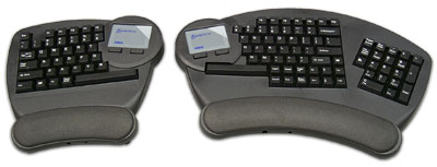
Kenesis Evolution

This was my second favorite. Again, it offers completely independent left and right side keyboards, with the added bonus of having a touch-pad built in to each side (for a price). I think that the integrated touch-pads are an excellent idea, as I’ve been getting more and more annoyed with switching my posture just to use my pointing device(s). I would have loved to try this out, but alas it looks like Kenesis doesn’t make it anymore. You might still be able to find one from a reseller or specialty shop, again likely for a pretty penny. It’s too bad this went away, as it looked to be exactly what I wanted, and seemed to be on par with the Datahand for looks. Oh well, to replace the Evolution, they are introducing the Freestyle.
- MSRP: $279 (one touch-pad), $349 (two touch-pads) (Note: Though discontinued, it seems this is still available here.)
Kenesis Freestyle

It doesn’t look as comfy as the Evolution, and it doesn’t have the integrated touch-pads. However, it does split the keyboard into independent left and right halves. Since it’s not yet available for purchase, I guess we’ll have to wait and see how much it costs. In the mean time, I decided to compromise with the Adesso.
- MSRP: ??? (Product not yet available)
Adesso 308 Tru-Form Pro

As I’ve been searching for ergonomic keyboards, various Adesso keyboards seemed to keep popping up. They make quite a few models, and the ones that seemed to best fit my needs adopted a form factor similar to the old MS Natural keyboard. A few of the models even had a built in touch pad…and to top it off, they seemed reasonably priced. So, for $68 dollars (including shipping and handling) I put an order in for the Adesso Tru-Form Pro. Unfortunately, they don’t yet seem to offer it in a USB version…and the similar keyboards that they do offer in USB don’t have the touch-pad. It’s not the end of the world, it now just means I’ll have to rejigger my USB KVM switch to accommodate this.
Conculsions
Sadly, ergonomics comes at a price…and so far, the price has been such that I cannot afford the top tier ergonomic keyboard solutions out there. I’m not opposed to paying for quality and design, especially if it will reduce some of the pain I’m experiencing. But this is quite a bit of money to fork out without really knowing for sure that it will improve things. For now, I’ll hope for the best with the Adesso. It’s a sad compromise, as I still believe that the idea of having a keyboard that conforms to my natural resting position would be the most therapeutic in the long run. Until the pain gets too bad or I get a raise, I’ll give the Adesso Tru-Form Pro a whirl at the office and let you know my thoughts on it. In the meantime, if anyone at the Kenesis or Datahand companies wants to throw a sample my way for a review, just send me an email!


